This past summer saw MMM participating in several conversations and sessions around opportunities and issues for mobile developers (with WIP Connector). More often than not, its isn’t the clearest of pictures for development when you start diving into niche arenas such as religious content. The market is indeed different, and the challenges can be pretty looming. Nevertheless, there are some consistent themes, especially in terms of getting apps to market and monetization.
This graphic, produced by Vision Mobile, makes it pretty clear the prospects for developers on the major mobile platforms. Especially as it relates to mobile software in the religious domain, paying attention to the installed base of users is just as important as just getting something developed – and you don’t want to spin your wheels learning how to develop for every platform.
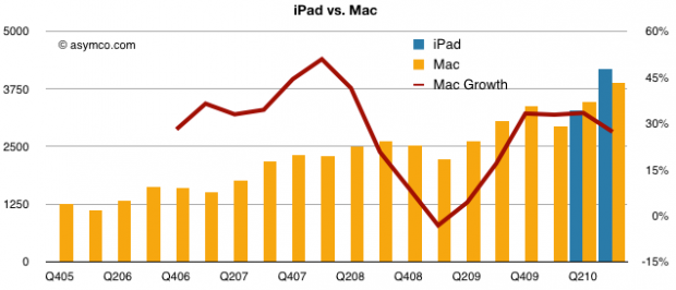
Another site that offers several info-graphics towards understanding opportunities within mobile can be found at Asymco. Asymco has a ton of data and usually packs in some solid commentary around his methodologies used. Here’s one graphic that some in the Bible software industry might find interesting:

Graphic from Visualizing iPad vs Mac, via Asycmo
Now, you can find info-graphics on a ton of areas within mobile, but you will want to make sure that you are viewing it through the appropriate lens. The data shown in this post is great, but you will need to combine it with data on (world/local) religions, tech adoption (economics), and probably media (text/publishing, audio/music, and video) in order for it to make the most sense contextually.
